Published on September 25, 2020
Byte of the Week: Accessible Stack Axis in SwiftUI
Since iOS 9 and the introduction of UIStackView, stacks have become a common building block on iOS. In SwiftUI, this functionality is provided by HStack and VStack.
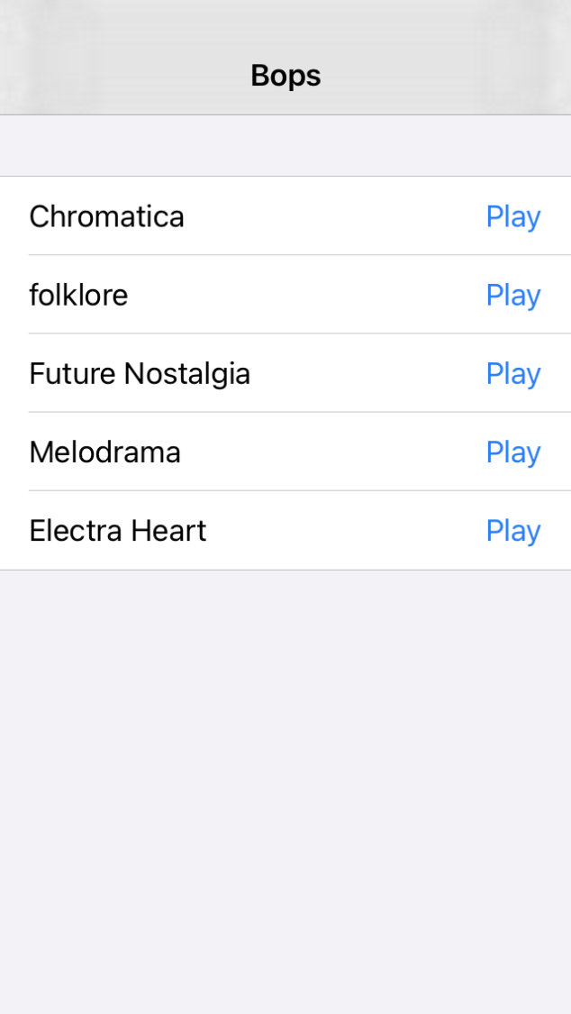
The following layout is very common: it is a row in a list that shows a text on the left and a button on the right. You would typically use an HStack for this.

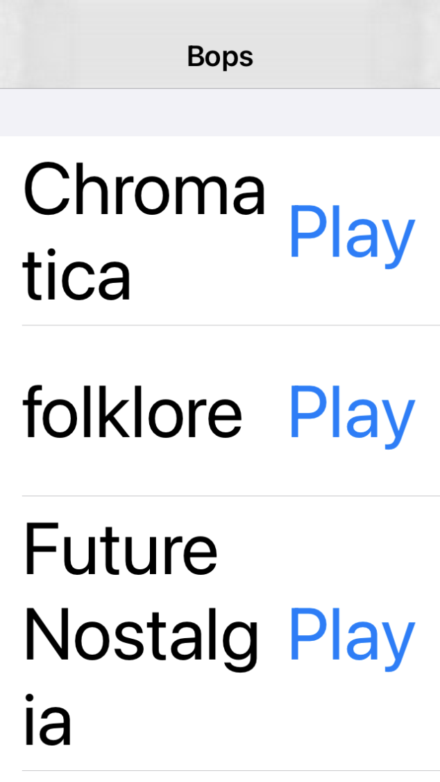
But when a user increases their font size using Dynamic Type, you would end up with the following layout, which is not very intelligible:

One solution to this problem is accessing the sizeCategory property of your view's environment to determine whether to use an HStack or a VStack. You can do so with the @Environment property wrapper.
@Environment(\.sizeCategory) private var sizeCategory
In MetroBuddy, I created a reusable view component that automatically switches the axis of the stack based on the isAccessibilityCategory property of the size category.
struct FlexibleStack<Content: View>: View {
    let hStackAlignment: VerticalAlignment
    let vStackAlignment: HorizontalAlignment

    let contentBuilder: (Axis) -> Content
    @Environment(\.sizeCategory) private var sizeCategory

    init(hStackAlignment: VerticalAlignment, vStackAlignment: HorizontalAlignment, @ViewBuilder content: @escaping (Axis) -> Content) {
        self.hStackAlignment = hStackAlignment
        self.vStackAlignment = vStackAlignment
        self.contentBuilder = content
    }

    @ViewBuilder var body: some View {
        if sizeCategory.isAccessibilityCategory {
            VStack(alignment: vStackAlignment, spacing: 16) {
                contentBuilder(.vertical)
            }
        } else {
            HStack(alignment: hStackAlignment, spacing: 8) {
                contentBuilder(.horizontal)
            }
        }
    }
}
Example
Using the FlexibleStack view above, we can fix our row layout:
struct Row: View {
    var body: some View {
        FlexibleStack(hStackAlignment: .center, vStackAlignment: .leading) { axis in
            Text("Rain On Me (with Ariana Grande)")

            if axis == .horizontal {
                Spacer()
            }

            Button("Play", action: {})
        }
    }
}
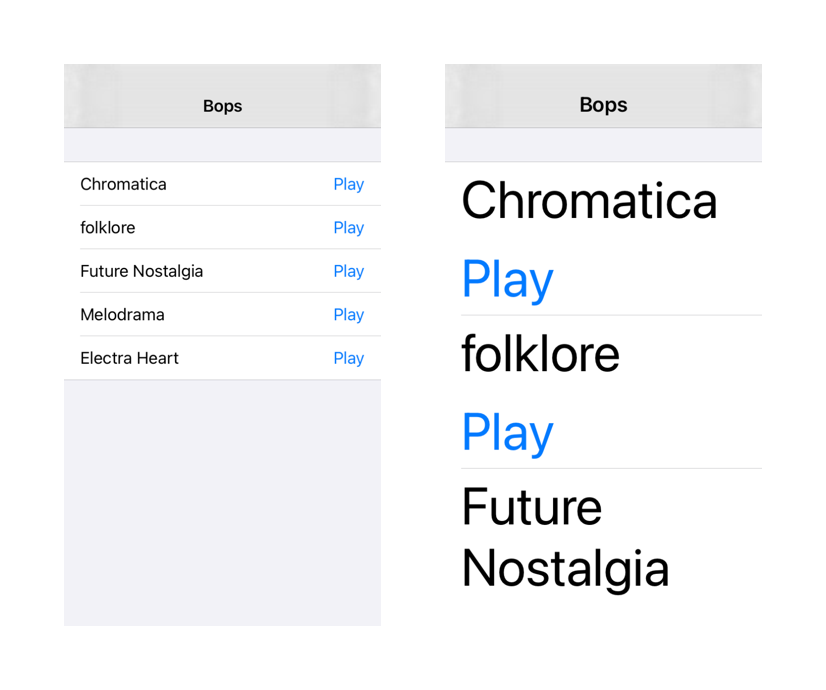
This is the result:
